As a graphic designer for PRÜF Creative and a minority stake partner in DC Beer Media, I had the opportunity to collaborate on a unique project with two emerging brands in the craft beer industry — DC Beer and Strange Fruit Brewing Co. My objective was to design a visual identity for our new collaborative pale ale, leveraging my skills and experience in the field.
In our kickoff briefing we knew we wanted to brew a new pale ale — a sessionable pale — that embodies the passion and expertise of DC Beer’s ownership and the vibrant multi-sensory approach of Strange Fruit Brewing Co. It was essential to capture the ethos of both brands and the distinctive features of this pale ale in the design.
Drawing on my expertise in visual communication and branding, I started developing design concepts that reflected the unique selling proposition of an entirely new beer varietal for Strange Fruit, and the shared brand values of the collaborating partners. The challenge was to create a design that could appeal to the craft beer enthusiasts and stand out in a competitive marketplace.
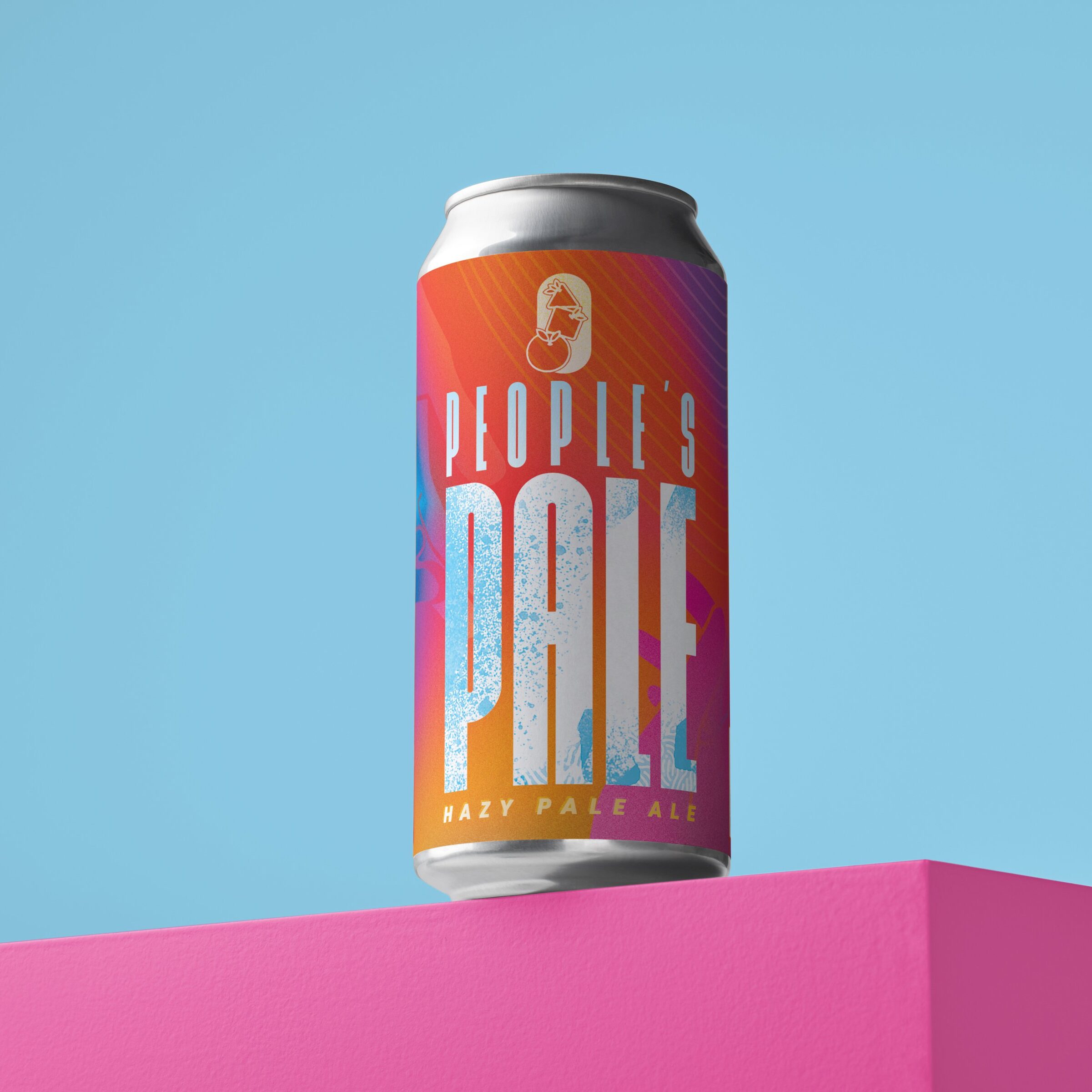
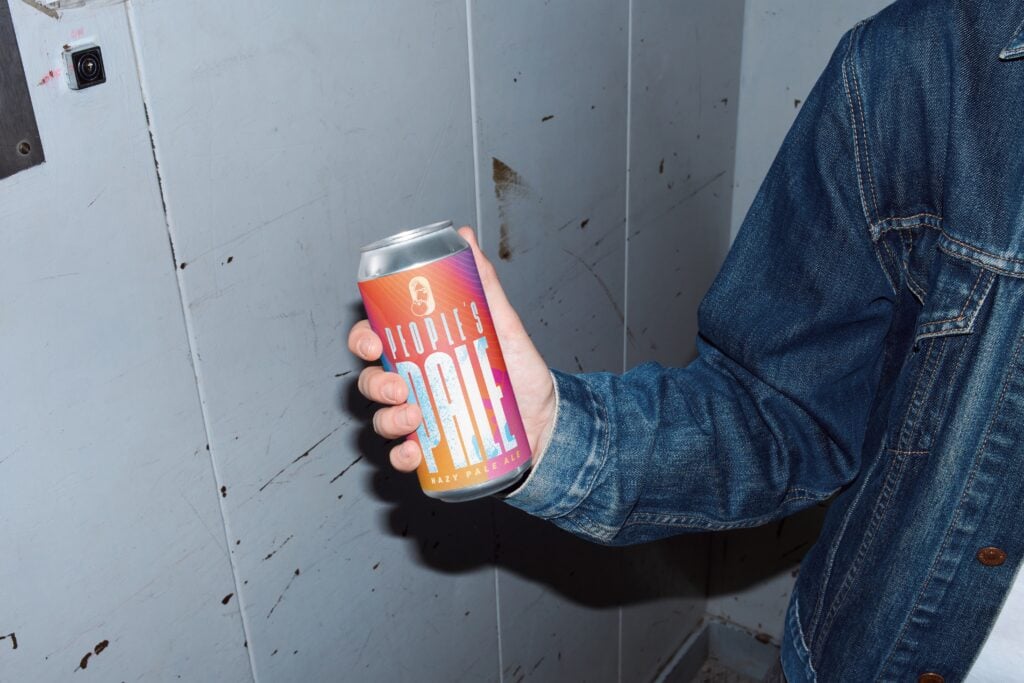
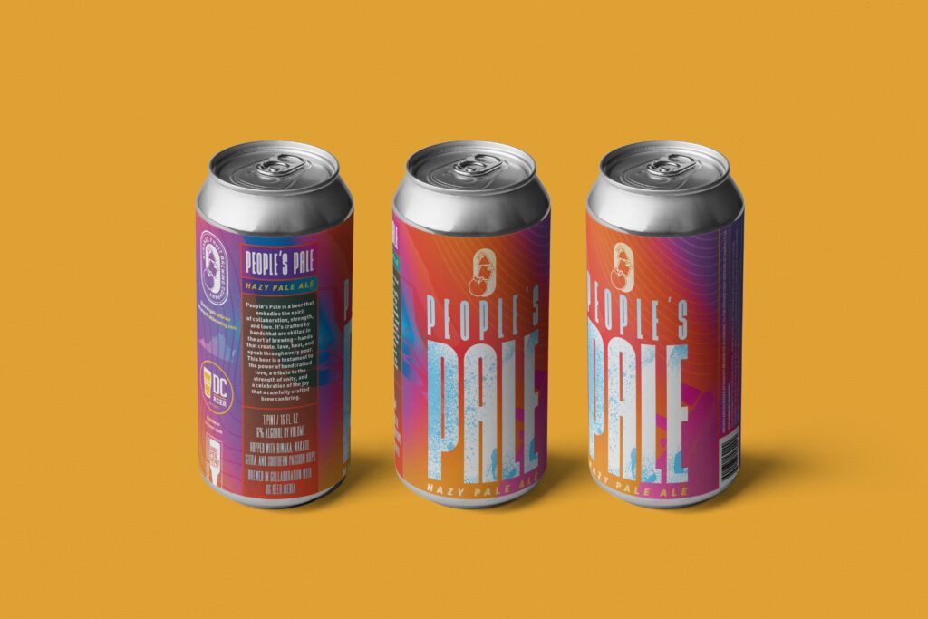
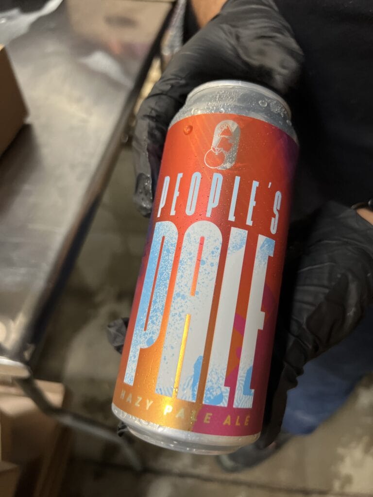
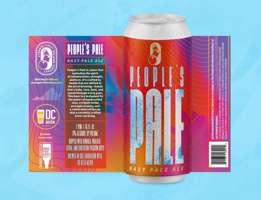
We came to rest on the idea of “people” — more specifically, an accessible pale ale, the ‘People’s Pale’. This is where the idea of hands come into play. After brew day, and several iterations and feedback sessions with DC Beer and Strange Fruit Brewing Co., we arrived at a final design.
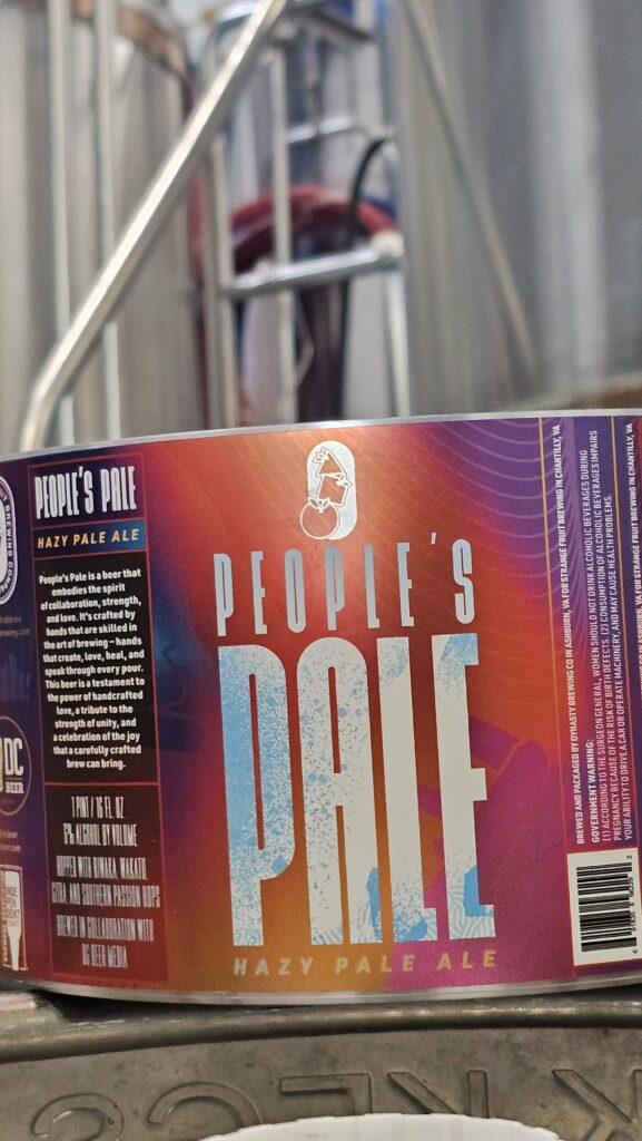
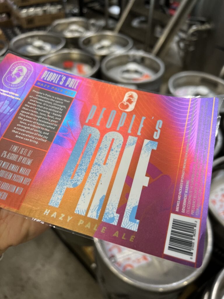
The design is a celebration of a rich and complex blend of flavors, and of the collaborative spirit of the project — beautifully encapsulating not only the characteristics of a pale ale but also the distinctive flavors and aromas that make this specific beer unique.
The presence of New Zealand hops is evident in “People’s Pale” distinct aroma, which couples grapefruit pith and Welch’s white grape with notes of oil slick. The Riwaka and Wakatu hops come forward with diesel-y, musky tropical fruit flavors. These are followed by a delightful aftertaste of lime zest and candied orange. The beer’s attenuation and carbonation are expertly balanced — emerging gracefully with each sip — making for a perfect drinking experience. Subtle undertones of cracked white pepper and lemon pith add a surprising twist to the flavor profile.
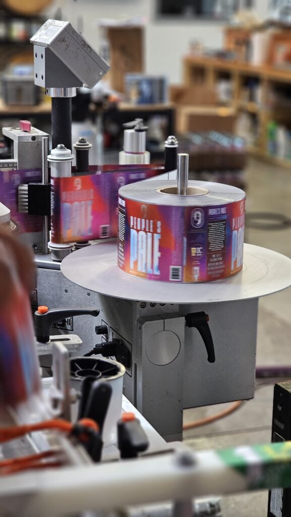
The label was printed on a foil substrate by Brooke + Whittle of Hamilton, Ohio, with special care taken to create separations for knockout and white overprint layers. The combination of the flat-white overprint and metallic sheen of the background graphics mirrors the beer’s flavor profile in an intentional bid to distinguish this beer from its peers when displayed on shelves and in coolers.
Coda
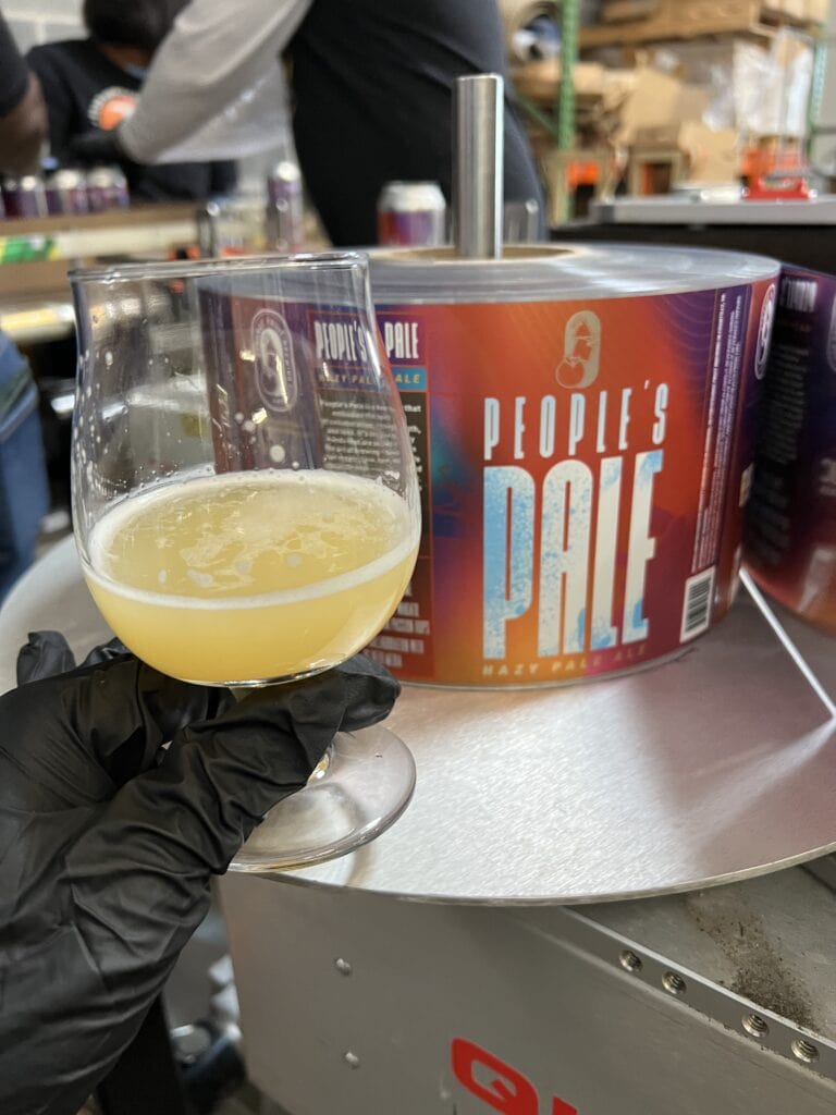
The project culminated in a successful launch event at Dynasty Ashburn. The event not only showcased the new pale ale but also highlighted the power of effective visual communication in creating a strong brand presence. It bears mentioning that Favio Garcia, Dynasty’s renowned brewmaster, DC Beer editor Jacob Berg, and DC Beer writer + Lost Lagers president Mike Stein all played significant roles in brewing the pale ale, further enhancing its appeal to DC area craft beer enthusiasts.
Post-launch, the new pale ale design was well-received by consumers and made its way to several retail outlets, including Total Wine in VA. The success of this project underscores the value of applying professional design skills in diverse contexts. It was a rewarding experience to contribute to the success of DC Beer and Strange Fruit Brewing Co. and help bring their collaborative vision to life.